Data Creation & Visualization
The map presented here is built of multiple layers and at first glance may look like many digital maps you see on a daily basis in multiple media. However, Mapping Historical New York: A Digital Atlas is built on historical atlases to create the data that powers the website.
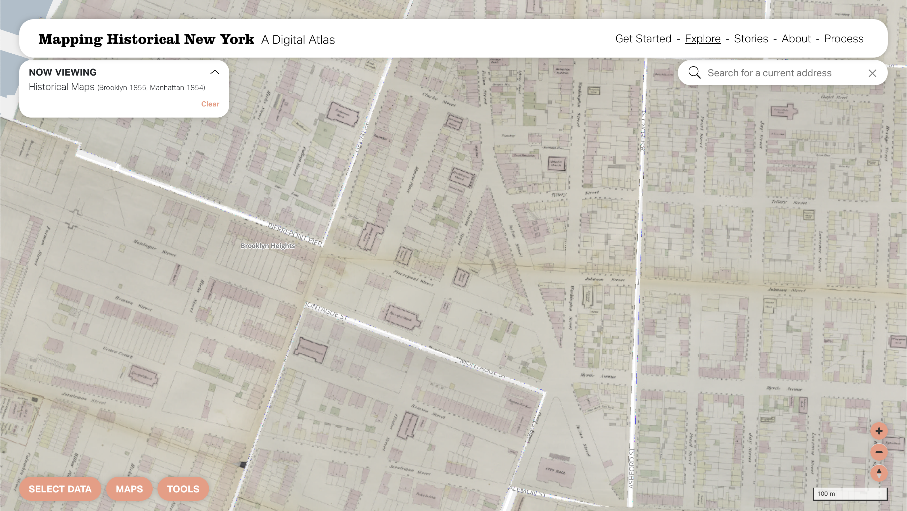
The first layer of the atlas, is the basemap, which you choose to show directly by selecting it for a specific year. To make this, we assigned geographic coordinates to the fire insurance atlas sheets, in a process called “georeferencing.” This process converts a scanned historical map image into a digital layer with embedded locations (latitudes and longitudes) within the image file.
The second layer uses the georeferenced historical basemaps, by tracing the historical streets across the city in 1850, 1880, and 1910 in a process called “digitizing.” Just like tracing by hand, the team drew digital lines for each “segment” as the one-block portion of each street or avenue. To these lines, we added additional information culled from the fire insurance atlases: the historical street names as well as its “address range,” the first and last building number along each segment, which are necessary for the next step.

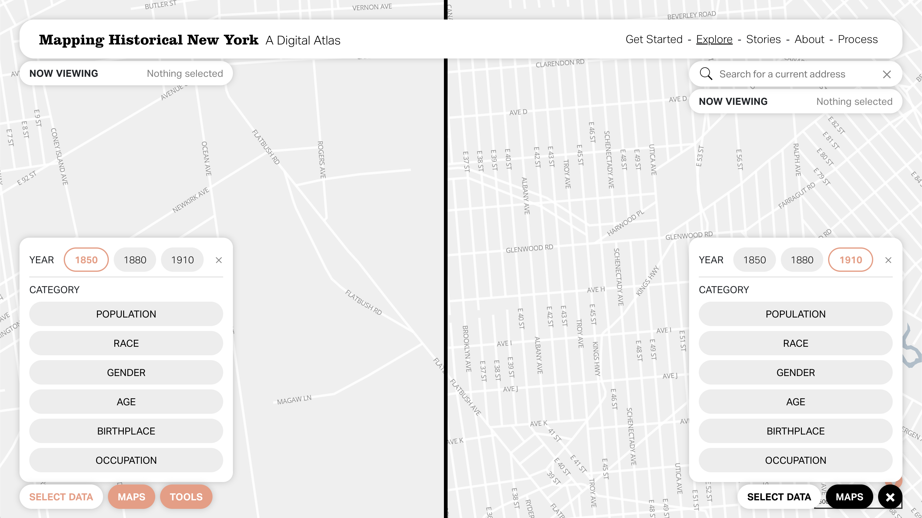
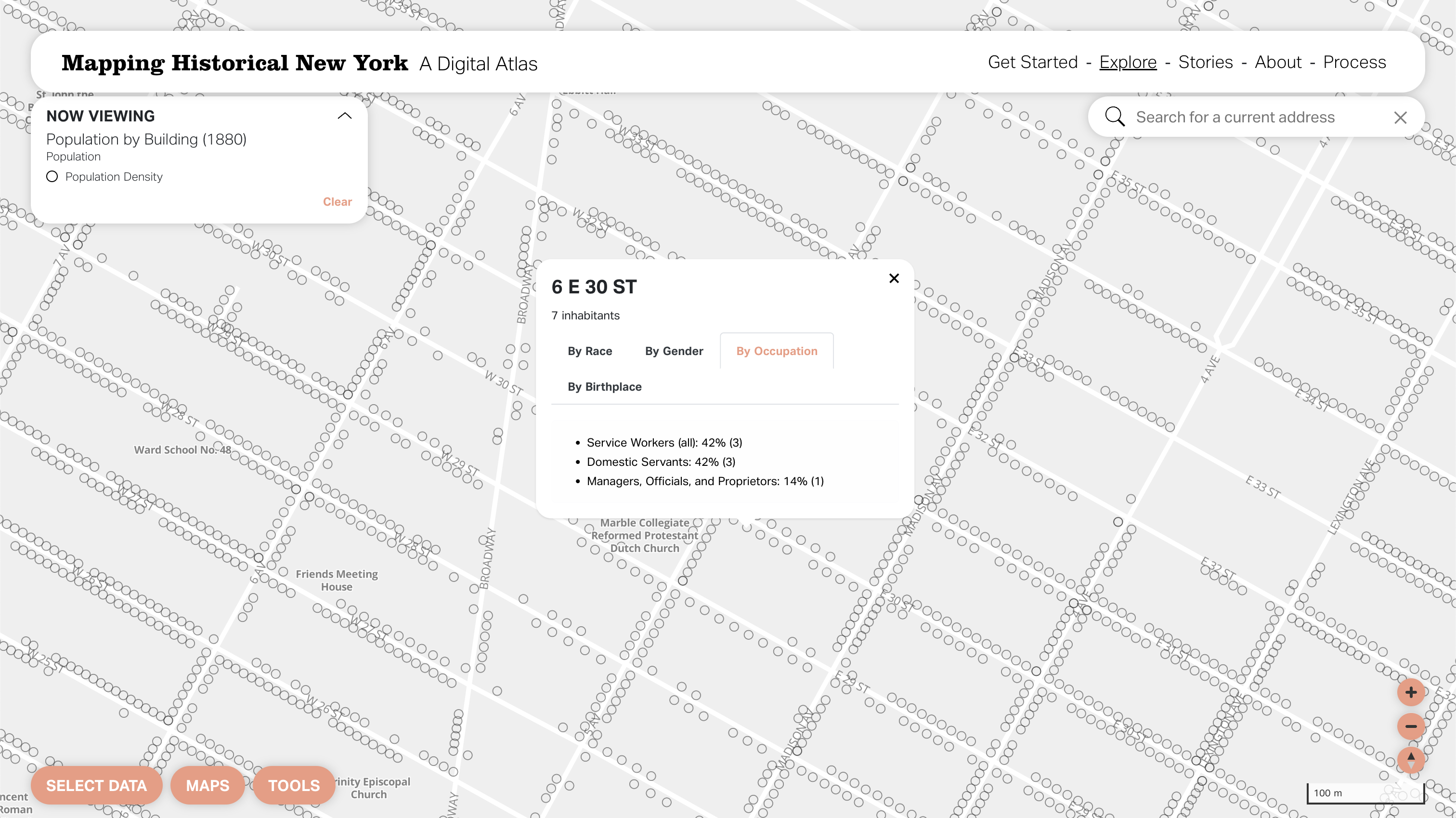
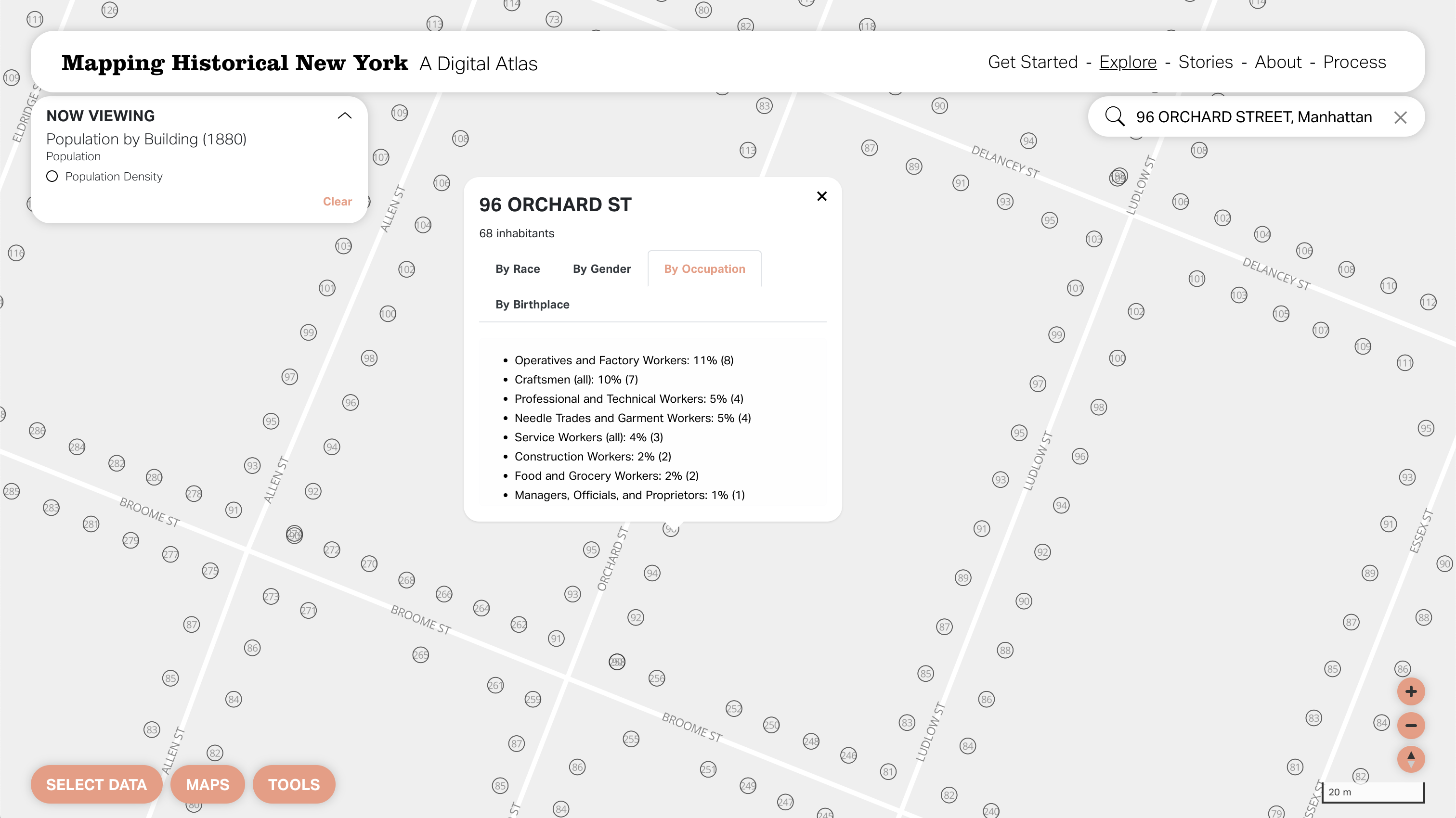
The third layer of the Atlas is a series of points representing the approximate locations of each building address included in the historical census records. This process is called “geocoding” and includes plotting a point at each historical address comparing the building number to the address range. You can click on these points to access a summary of the residents at each address or visualize separate residents in a “dot density” map. Many users may be familiar with this type of visualization because it is useful in showing both quantity (“how many?”) and category (“what type?”) within a single map. Many dot density maps summarize individuals to show a diversity of races. Often these maps group individuals into blocks or larger areas. In Mapping Historical New York, the dot density maps show each person as a dot clustered around their building address, with different colors for several census categories, including race, birthplace, gender, and occupation.
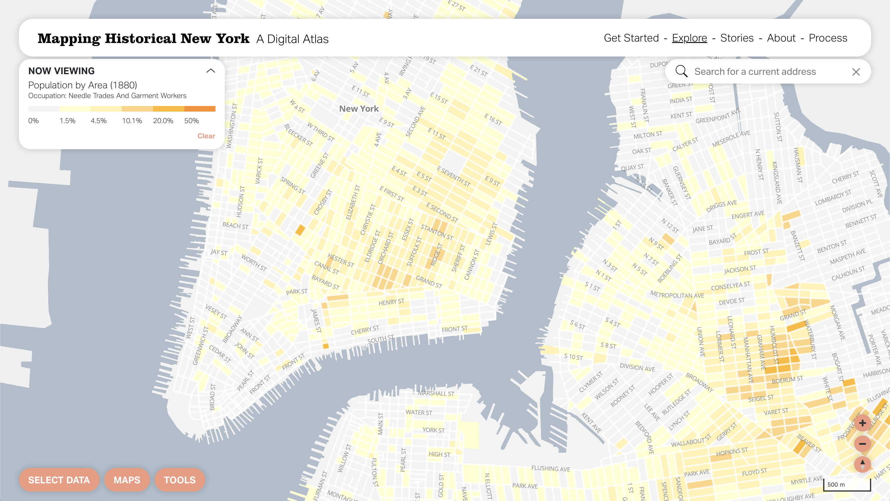
The fourth layer of the Atlas zooms out one step farther, collecting the building-level information into city blocks. We created this layer from the digitized streets and aggregated the geocoded census records to the blocks, which allows a user to visualize the census categories as city-wide “choropleth” maps. Choropleth maps show quantities of a single characteristic and show variations across an area. In our map, for example, you can visualize the percentage of each block’s residents who were domestic workers, African-American, or born in Ireland. Larger areas, including enumeration districts and wards, can also be used for choropleth mapping. We have chosen the smallest unit (city blocks) because it can illustrate variations between and within neighborhoods.
Data Sources
The maps use 6.5 million unique census records for 1850, 1880, and 1910, matched to home locations in Manhattan and Brooklyn, available from contemporary fire insurance atlases. Early census records often do not record specific street addresses. For 1850, we relied on city directories (which include names, occupations, and addresses) and tracked the paths walked by census takers.
Since the map relies on census data and insurance maps, it is incomplete. Not all populations residing in the city were properly recorded in these counts. This includes populations on the city’s geographic edges and other precarious locations such as cellar-dwellings and boarding houses, which disproportionately coincide with certain demographic groups. For example, following the abolition of slavery in the state in 1827, there was likely an undercount of the Black populations. Other undercounted groups included seasonal laborers, many of them European immigrants, who may have missed the census enumeration.
The Census asked several questions in addition to counting the population. These include national origin, place of birth, race, sex, marital status, age, literacy, and occupation. The Digital Atlas combines census responses with the cartographic record of the historical city to map and visualize neighborhood and citywide demographic patterns and changes.
While the map includes individual census records, individual names are not displayed and cannot be searched.
Citations
Steven Manson, Jonathan Schroeder, David Van Riper, Tracy Kugler, and Steven Ruggles. IPUMS National Historical Geographic Information System: Version 16.0 dataset. Minneapolis, MN: IPUMS. 2021. http://doi.org/10.18128/D050.V16.0
Robert W Fogel, Dora L Costa, Carlos Villarreal, Brian Bettenhausen, Eric Hanss, Christopher Roudiez, Noelle Yetter, and Andrea Zemp. Historical Urban Ecological data set. Chicago: Center for Population Economics, University of Chicago Booth School of Business, and The National Bureau of Economic Research, 2014
The New York Public Library. NYPL MapWarper and Digital Collection. http://maps.nypl.org
The New York Public Library. The New York Public Library Space/Time Directory. http://spacetime.nypl.org
John R. Logan, Jason Jindrich, Hyoungjin Shin, and Weiwei Zhang. 2011. "Mapping America in 1880: The Urban Transition Historical GIS Project" 8Historical Methods* 44(1): 49-60.
Allison Shertzer, Randall P. Walsh, and John R. Logan. 2016. “Segregation and neighborhood Change in Northern Cities: New Historical GIS data from 1900-1930” Historical Methods 49, 4: 187-197.
NYC DoITT. NYCityMap, http://www.nyc.gov/citymap
Methodology
Methodology
This is the methodology page.